ILJIN Electric
-
Business Area

By Business Division
- Company
-
Investor Relations

Investor Relations
- Media Center
-
Sustainability

Sustainability
- Careers
- Customer Support


Company
Corporate Identity (CI)
Corporate Identity (CI)This section introduces ILJIN Electric’s Corporate Identity (CI) and provides access to original CI files for download.
Symbols & Concepts
Symbols & ConceptsILJIN’s wordmark is the core visual symbol of our brand,
representing the image of the entire ILJIN Group.
The wordmark embodies ILJIN Group’s progressive and pioneering spirit, reflecting our commitment to continuous change and growth from past to present and into the future. The square frame symbolizes solid corporate assets and the stable growth built upon them.
The circular “○” in ILJIN’s logo is rendered as a dynamic shape, symbolizing the Group’s limitless potential for future growth. The letter “J” is stylized as a human figure, expressing ILJIN’s commitment to valuing its people as a core asset.
The blue color represents ILJIN Group’s forward‑looking corporate image, leading in advanced technology and globalization. The orange color embodies a venture spirit of challenge and innovation, as well as our passion for the future.
Principles of Use
Principles of useWordmark Spacing Rules
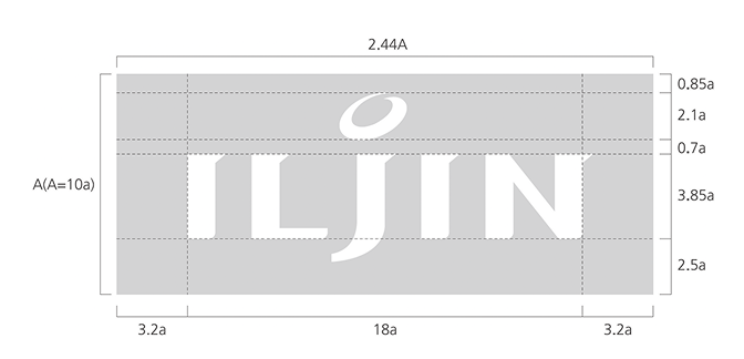
ILJIN’s wordmark spacing rules are based on the principle that no element may encroach on the designated clear space surrounding the wordmark.
This rule ensures proper usage and preserves the integrity of the brand image, and must be strictly observed.
Operates sports science classes for athletes, coaches,
and parents.

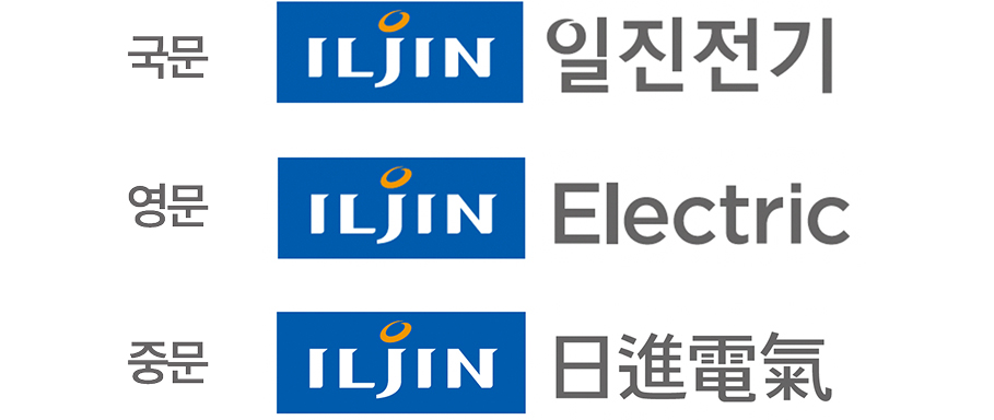
Logotype
The logotype is a distinctive symbol representing the company name and, together with the wordmark, forms a core element of ILJIN’s brand identity.
Each character in the logotype has been proportionally adjusted, so its shape, weight, and overall proportions must never be altered.

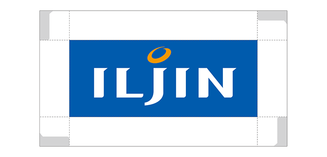
Signature
The signature combines ILJIN’s core elements—the wordmark and logotype—in a logical, structured arrangement and serves as the most effective means of communicating ILJIN’s brand image both internally and externally.
When using the signature, the configurations shown below must be followed without modification.

Exclusive Colors
ILJIN’s dedicated colors play a critical role in conveying our brand image across various media, including print materials, promotional items, and signage.
They must be used and managed with precision, maintaining accurate color tones, brightness, and saturation at all times.
-
ILJIN BLUE
PANTONE 300C
RGB / R12 G65 B154
CMYK / C100 M60 -
ILJIN
ORANGEPANTONE 137C
RGB / R255 G127 BO
CMYK / M50 Y100
-
ILJIN Light Gray
PANTONE Cool Gray 2C
RGB / R230 G230 B230
CMYK/ K10 -
ILJIN Gray
PANTONE Cool Gray 5C
RGB / R230 G230 B230
CMYK/ K10 -
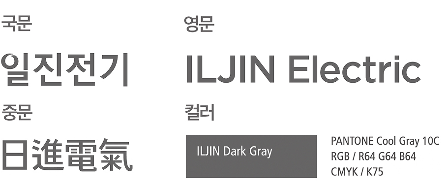
ILJIN Dark Gray
PANTONE Cool Gray 10C
RGB / R64 G64 B64
CMYK/ K75 -
ILJIN Dark Blue
PANTONE 295C
RGB / R13 G40 B79
CMYK / C90 M70 Y15 K60 -
ILJIN Gold
PANTONE 873C
-
ILJIN Silver
PANTONE 877C